The Page as Object: What Illuminated Manuscripts Were Actually For
The illuminated manuscript is easy to misread as luxury. The floral borders, the painted miniatures, the red rubrication that punctuates columns of dense black script — these look, to modern eyes, like ornament. Like excess. The assumption is that the decoration exists to display wealth, and that the text is the real content while the image is the frame around it. Both assumptions are wrong.
The border was not decoration in the sense of being separable from the content. In Spanish and Flemish manuscripts of the fifteenth century — the tradition this page belongs to — the marginal flora and fauna carried iconographic weight. Specific flowers and insects carried symbolic meaning legible to contemporary readers: the violet signified humility, the strawberry righteousness, certain insects referenced the transience of earthly life. A reader trained in this visual language was reading the margins as a commentary on the text, not ignoring them as wallpaper. The border was a gloss.
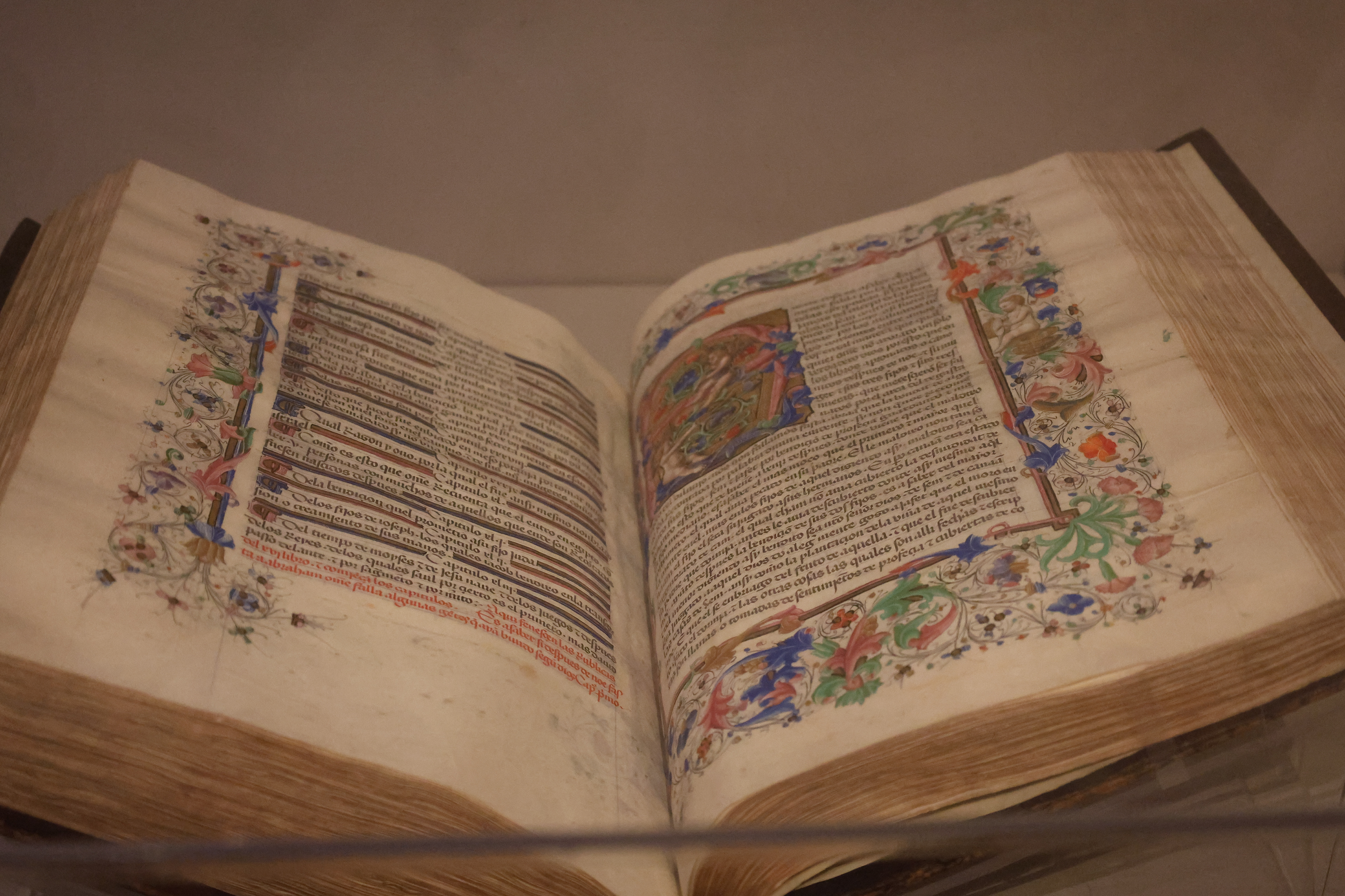
The red ink — rubrication — served a function that we now accomplish with typographic hierarchy. Section headings, chapter openings, liturgical instructions, and the names of saints were written in red to distinguish them from the main text and allow the reader to navigate the page visually. In a world without page numbers, consistent typography, or search, the manuscript’s visual organization was its information architecture. The scribe who chose what to rubricate was making editorial decisions.
The miniature — the small painted scene embedded in the text — was not illustration in the modern sense of visualizing what the words describe. It was often doing something more lateral: providing an interpretive key, connecting the passage to a visual tradition the reader would recognize, or establishing the devotional register the reader should bring to the text. In Books of Hours, which were the personal prayer books of wealthy lay readers, the miniatures depicting the Virgin or scenes from the life of Christ were objects of contemplation as much as images accompanying a text. You were meant to look at them, not past them.
What this means is that the illuminated manuscript was a total object. Text, image, color, material, and sequence were conceived together and worked together. The vellum page had a weight and texture that contributed to the reading experience. The binding determined how the book opened and how the spreads related to each other. None of this was incidental. The manuscript was not a container for a text. It was the text’s full realization — the form in which the content was complete.
The digital reading environment has made this easy to forget. Text on a screen is infinitely reproduced, resizable, reformattable, stripped of every material quality the original object possessed. This is mostly an advantage. But something is also lost when we read a transcription of a manuscript and believe we have read the manuscript. The page in the photograph is not a vehicle for its words. It is, itself, the thing.